TapTap – A Super Customizable Mobile Menu
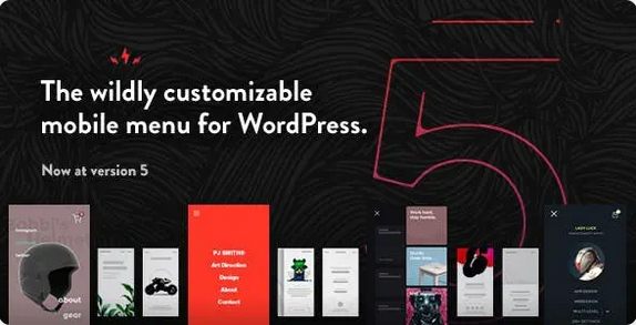
With TapTap, we set out to create an easy-to-customize, responsive, mobile-first, off-canvas menu plugin for WordPress that would be versatile enough to be used on literally any website.
Be it a creative’s portfolio or a corporate site, mixing and matching fonts, font sizes, icons, letter spacing, colors, button and logo positions, backgrounds, alignments, animation speeds etc. allow you to quickly create a responsive menu that’s uniquely yours. Forget pre-determined layouts and build the mobile menu you want. Preview any changes you make in real-time and customize your new menu faster and easier than ever.
TapTap full features list:
TapTap is wildly customizable and by far the most versatile WordPress mobile menu available anywhere. To get acquainted with everything you can edit, add and customize, please have a look at the full details on TapTap’s near-endless possibilities below.
Menu Button
Position menu button left or right, then fine-tune top/side distance with per-pixel accuracy
Open menu by click/tap or by mouseover
6 different menu button styles
Each style has regular and thin variations (12 designs total)
Each button has two different animations (or no animation at all)
Set custom animation speed
Set button opacity
Customize color, hover color (+ colors when menu active)
Add label to menu button
Enter custom label text
Position label anywhere around the button with per-pixel accuracy
Set custom font size
Set custom letter spacing
Select label font (12 options available, or use a theme font)
If menu button is hidden, label will remain visible (if one is entered) and can be used to activate the menu
Customize label color, hover color
Optionally hide menu button (useful if you’d like to use a custom element to activate the menu)
Logo Placement
Position logo left, center or right, then fine-tune top/side distance with per-pixel accuracy
If logo entered as text:
Set custom font size
Set custom letter spacing
Select logo font (12 options available, or use a theme font)
Customize color, hover color
If logo entered as an image:
Set custom logo image size
Optionally hide logo placement
WooCommerce Cart Button
Position WooCommerce button left or right, then fine-tune top/side distance with per-pixel accuracy
Cart and shopping bag icon variations
Customize colors, hover color
Search Button
Position search button left or right, then fine-tune top/side distance with per-pixel accuracy
Regular and thin search button variations
Optionally flip search button for additional variations
Customize color, hover color
Add label to search button
Enter custom label text
Position label anywhere around the button with per-pixel accuracy
Set custom font size
Set custom letter spacing
Select label font (12 options available, or use a theme font)
If search button is hidden, label will remain visible (if one is entered) and can be used to activate the search function
Customize label color, hover color
Optionally hide search button (and the function along with it)
Search Function
Set custom appearance animation speed
Seach field:
Set custom searchfield placeholder text
Customize search field height
For RTL support, align searchfield text to the right
Hide ‘clear field’ option
Set custom font size
Set custom letter spacing
Select label font (12 options available, or use a theme font)
Change search field background opacity
Customize colors of search field background, placeholder and search text, close and ‘clear field’ buttons
Set background overlay opacity and color
Header
Show/hide header
Set custom header height
Change header background color
Change header background opacity
Show/hide header background shadow (+ set shadow strength)
Menu Container, Menu, Widgets etc.
General:
Display menu fly-out as full-screen or set custom width/height
Height is applicable when menu is set to animate from top/bottom.
Width is applicable when menu is set to animate from left/right.
Set menu to appear by fading in or sliding from left, right, top or bottom
Set custom menu appearance speed
Optionally show submenu when current (have menus open when on current menu item)
Optionally close menu after clicking on menu item (useful on one-page websites)
Align menu contents left/center/right and top/middle/bottom
Give content inside the menu container maximum width
Alter menu contents’ scaling animation (any scaling level, positive or negative, or disable altogether).
Set custom left, right, top and bottom padding menu container
If on desktop, pressing the ESC button closes the menu and search
Change menu background overlay color and opacity
Background:
Add background image or pattern
Control corner roundness and distance from screen edges
Change background image positioning
Change background image opacity
Change background color
Change background color opacity
Create animated, pulsating or gradient color backgrounds (+ change animation speed)
Add heading, subheading texts:
Change fonts (12 options available, or use a theme font)
Change font sizes
Change letter spacings
Change line heights
Turn heading texts into links
Add heading image:
Set maximum size
Turn heading image into a link
Set top and bottom margins
Accordion menu:
Build a multi-level menu (no depth limit)
Add descriptions to single-level menu items
Set vertical spacing between menu items and menu descriptions
Change fonts (12 options available, or use a theme font)
Change font sizes
Change letter spacings
Change line heights
Change all colors
All font options can be set individually for top-level and sublevel items as well as menu descriptions
Add icons to menu items:
600+ icons available
Change icon size (separately for top-level and submenu items)
Change icon color (separately for top-level and submenu items)
Customizable styled scrollbar:
Customize scrollbar colors
Customize scrollbar thickness
Customize scrollbar distance from the sides
Customize scrollbar corner roundness
Show the scrollbar always or only on mouseover
If styled scrollbar is enabled, it will be displayed on desktop only. On mobile, the device’s native scroll behavior is used.
Content animation effects (applied to selected content when menu opens/closes):
Scaling
Opacity
Blur
Widget locations:
Widget locations above as well as below the menu
Text widget accepts shortcodes
Select fonts (12 options available, or use a theme font)
Set custom font sizes
Set custom letter spacing
Set custom line heights
Change colors (titles, content, links)
Set font settings individually for widget titles and content
TapTap Misc
Show/hide at specified resolutions (show on mobile and hide on desktop, or vice versa)
Hide completely on specified posts/pages
‘Smart header’ option (header elements slide out of view when site scrolled down, slide back into view when scrolled up).
Hide theme menu, logo etc. when TapTap is active, by the class/ID of the theme elements
Optionally lock body scroll when menu opened
A dozen carefully selected font variations included (or use your theme fonts)
Open submenus from arrow indicator or full top-level menu item
Optionally have TapTap open by default on the front page
Toggle the menu via a custom element, via an activator class
Display alternate close menu button. Available options include left/right positioning and position fine-tuning, fixed or absolute positioning, an optional hover animation, color and thickness settings.
RTL support
WordPress multisite compatible
Absolute/fixed positioning
Have the logo, search and header appear above or below menu
Optionally don’t load Font Awesome and/or Line Awesome icon sets (useful if you don’t use icons in your menu or if something in your installation already loads this widely used icon set)
Optionally disable retina support (in case you don’t make use of the image possibilities in the plugin)